Brochure or Front Door? What Your Website Actually Needs to Do
Most small business websites just describe the business and sit there. The ones that work do something the moment a visitor lands. The plain essentials.
Picture two websites for the same business. The first is a brochure: it looks nice, it tells you who they are, and it leaves you exactly where it found you — to figure out the next move yourself. The second is a front door: the moment you land, there's a way in, and it's obvious what to do next.
Most small business websites are brochures. Not bad-looking — often quite handsome — they just sit there and describe the business. A front door does something. That's the whole difference between a site that looks busy and a site that actually is busy.
Here's what turns one into the other. None of it is technical, and most of it you can check on your own site in the next ten minutes.
One clear thing to do
Walk up to your home page as if you've never seen it. What does it want you to do — call, book, send an enquiry? If the honest answer is "well, a few things, depending," that's the problem. A visitor who has to choose between five buttons usually picks none of them and leaves.
Pick the single action that matters most to your business and make it the obvious one — bigger, bolder, repeated near the top and again at the bottom. Everything else can still be there. It just shouldn't compete. One clear front door beats five half-open ones.
Make saying yes easy
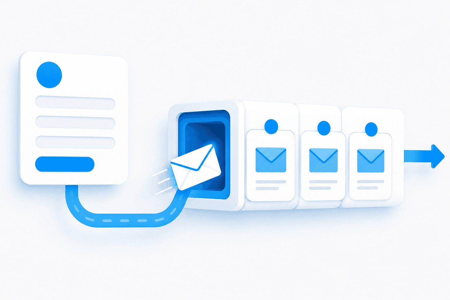
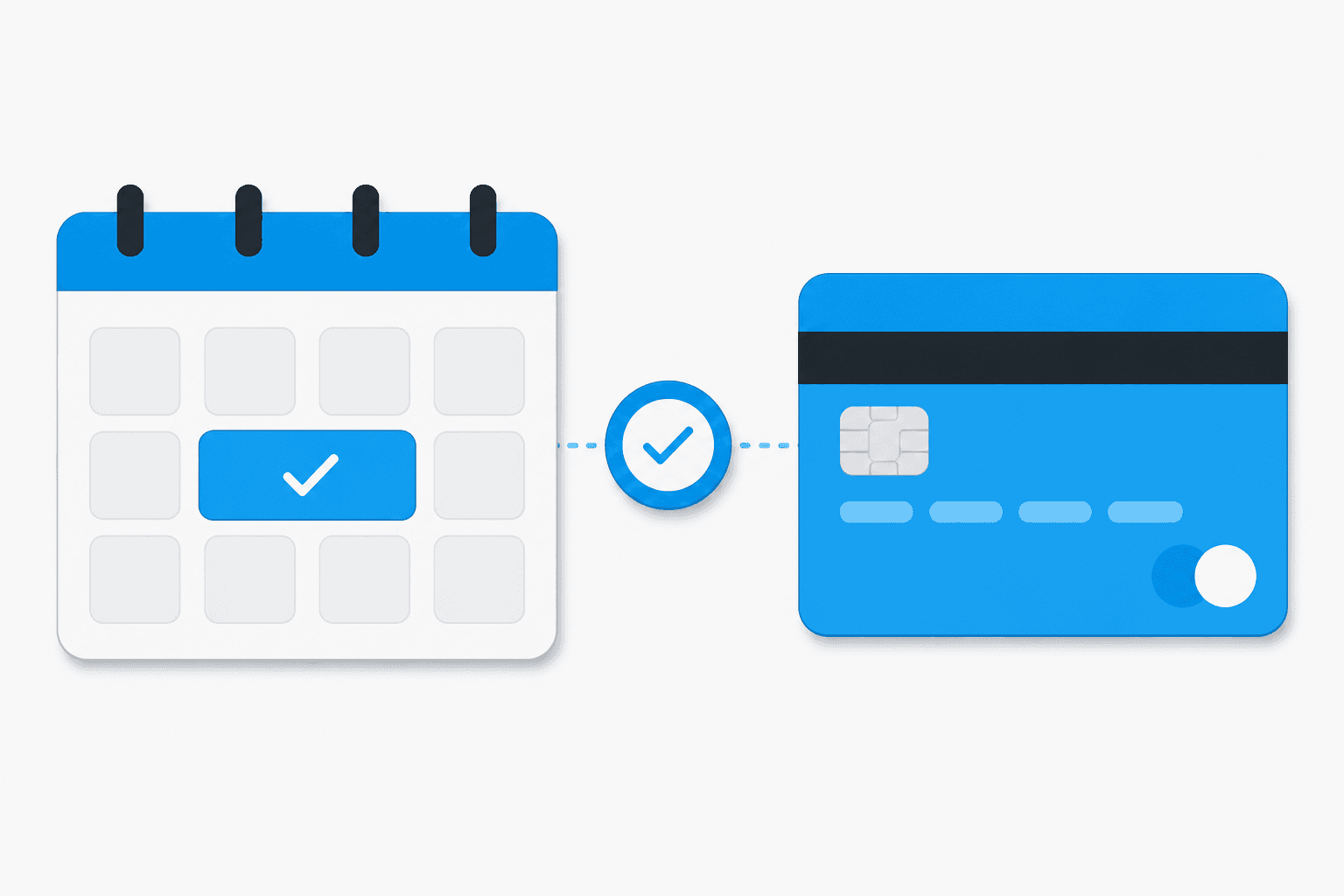
When someone does decide to reach out, the easier you make that moment, the more people finish it. A phone number that's tappable on a phone. A short form that asks for what you actually need and nothing extra — every box you add is another reason to give up halfway. A booking link, if booking is how you work, so they can pick a time at eleven at night without playing phone tag with you on Monday.
The mistake to avoid is the long form. Asking ten questions feels thorough; it mostly just thins the herd of people who were ready to talk to you. Get the conversation started, then learn the rest.
Tell them what happens next
This one's quietly powerful and almost nobody does it. After someone enquires, say what happens now — "I'll get back to you within a day," a thank-you page, a quick automatic email so they know it went through. A reply that never lands, or lands so late they've already called someone else, is the most common leak in a small business, and it's a shame because the hardest part — getting them to raise their hand — already happened.
Give them a reason to trust you
A stranger landing on your site is doing a quiet bit of risk assessment, and a few plain signals settle it fast:
- Real reviews. A handful of genuine ones from real customers does more than any amount of polish. This is the same word-of-mouth that increasingly decides whether you get named when someone asks an AI for a recommendation — so it's worth the unglamorous habit of asking happy customers to leave one.
- A real photo. You, your team, your actual place. Stock images of strangers in suits do the opposite of what you'd hope.
- Plain answers. What you do, who you're for, where you are, what it costs to get started. A stranger weighing you up wants the same clarity a busy regular does. Say it in normal words.
And one signal sits underneath all of these: whether the site looks alive. A copyright date stuck three years ago, a "latest news" from 2021, prices you know are wrong, a contact form that bounces — each one quietly tells a stranger you've stopped paying attention, and a business that's stopped tending its own front door isn't one people rush to trust. You don't need to blog or post. You just need the thing to read as current and cared-for, because a neglected site signals neglect — and that's the one impression you can't afford to give the person deciding whether to risk you.
Fast, and works on a phone
Most of your visitors are on their phone, often with one bar of signal, deciding in a few seconds whether to bother. If your site is slow to load or fiddly to use with a thumb, plenty of them are gone before they've seen a word of how good you are. You don't need to understand the plumbing — just open your own site on your phone, off wi-fi, and see how it feels. If you lose patience, so does everyone else.
The honest part
You can have every one of these and still not get more customers — because, as the buyer's guide puts it, a website nobody can find is worthless, and a website alone does almost nothing. This page is about one block of the board: what your site does when someone actually lands on it. Getting them there is a separate job, and so is everything that happens after the enquiry.
And don't take any of this on faith, including from me. The point of a front door isn't to look more done — it's to turn more of the people who land into people who reach out. Whether a change actually did that is a thing you can measure rather than guess, and worth measuring before you spend on anything bigger.
If you want a plain read on whether your site is a brochure or a front door — and the one or two changes most worth making — that's exactly the kind of thing I like looking at. It's a 15-minute, no-pitch conversation: you tell me how your business works, I tell you what I see. Have a look here.